It’s A Sign, People
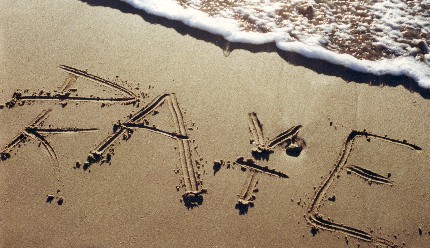
When I first started dating the man who would become my husband, he showed me this neat trick he could do with his name. When he wrote his first name above his last name, the second and forth letters lined up and were the same in both, so he’d draw them as one. Naturally, it was serendipitous when he showed me the same trick could be done with my name.
Aww, how romantic. A sign we were meant for each other?
I’ve been toying around with using this idea for a logo for myself – using KateWares, of course – for years. But I could never seem to make it look quite the way I wanted. As a result, I’ve been putting off making a sign for my craft table etc. for, well…a long time. But not anymore! Thanks to the kick-in-the-pants that this blog is providing, I spent parts of this weekend working on said sign. I also spent parts of it cleaning up my kid’s vomit and tending to my own sore throat, so it’s taken a while to get done. But that’s life, isn’t it?
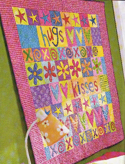
Since the stacking idea wasn’t working for me, it was time to try something new. I’ve always liked the look of funky quilted lettering (see also the last photo in the last post)…
From Better Homes and Gardens, Quilting Ideas, Fall ’03.
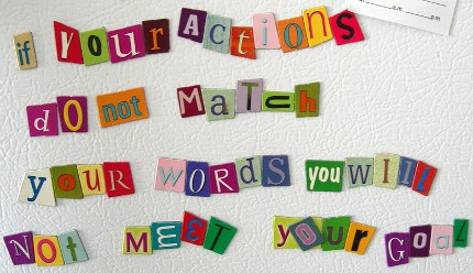
…and the whole “ransom note” genre…
Somebody’s cool fridge magnets – a future project I think!
So I started playing around with ways to put the two together. First, I typed out “KateWares” in a variety of fun fonts – just to get a feel for different cursive forms. Then, I pulled out a schwack of old scrapbooking left overs (time for a little “green” crafting), sharpened my pencil, and found a good eraser.
I sketched out several big, blocky letters on a scratch pad before deciding on the basic feel of the letters. Then I decided on a final size for my sign and sized some paper blocks accordingly. I sketched each letter onto a paper block, and then cut them out using an X-acto knife – which seemed to have a will of it’s own, changing a few of the letters for the better. Then, I found coordinating cardstock for the backings, put the two together, and viola!
KateWares new 11×14″ sign – all framed and everything.
I decided to do the tag line at the bottom using standard punch out letters (Alpha Stax by Colorbok), tracing them onto my own paper if necessary, to save time. I also added a floral detail for interest. So…what do you think?


5 Replies to “It’s A Sign, People”
Well, *I* like it.
😉
I like it! Very Kate-Krafty goodness! 😀
Thanks!!!
=) K
It is just wonderful!! Beautiful and — soooo creative.
Love the dialog <3
Aw, thank you! =) K